Case Study TB04
WEST TEXAS FC
League
National Premier Soccer League (NPSL)
Service
Rebrand
Location
Midland-Odessa, TX
Year
2022-23
The Ask
The ownership of Midland-Odessa Sockers (NPSL) wanted a fresh start with a rebrand. They wanted not only to represent the Permian Basin, but also West Texas as a whole. We were approached to bring their vision to fruition.
Paint it Black
Our process begins in flat black. It’s our belief, especially with sports logos, that if it doesn’t work in one color, packing in more won’t help. There are many instances where merchandise requires a single-color graphic… we like to think ahead.
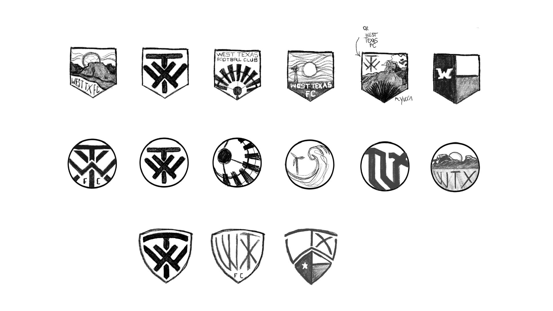
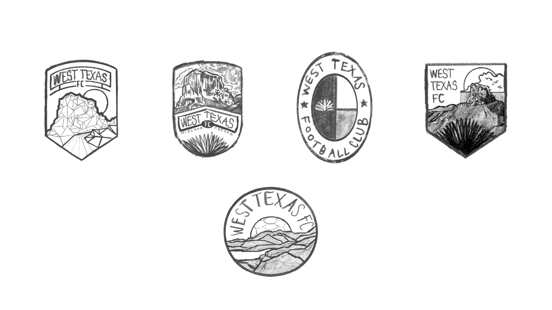
Initially, we provided the client with a multitude of sketches (see the Extras section at the bottom of this page for a glimpse).
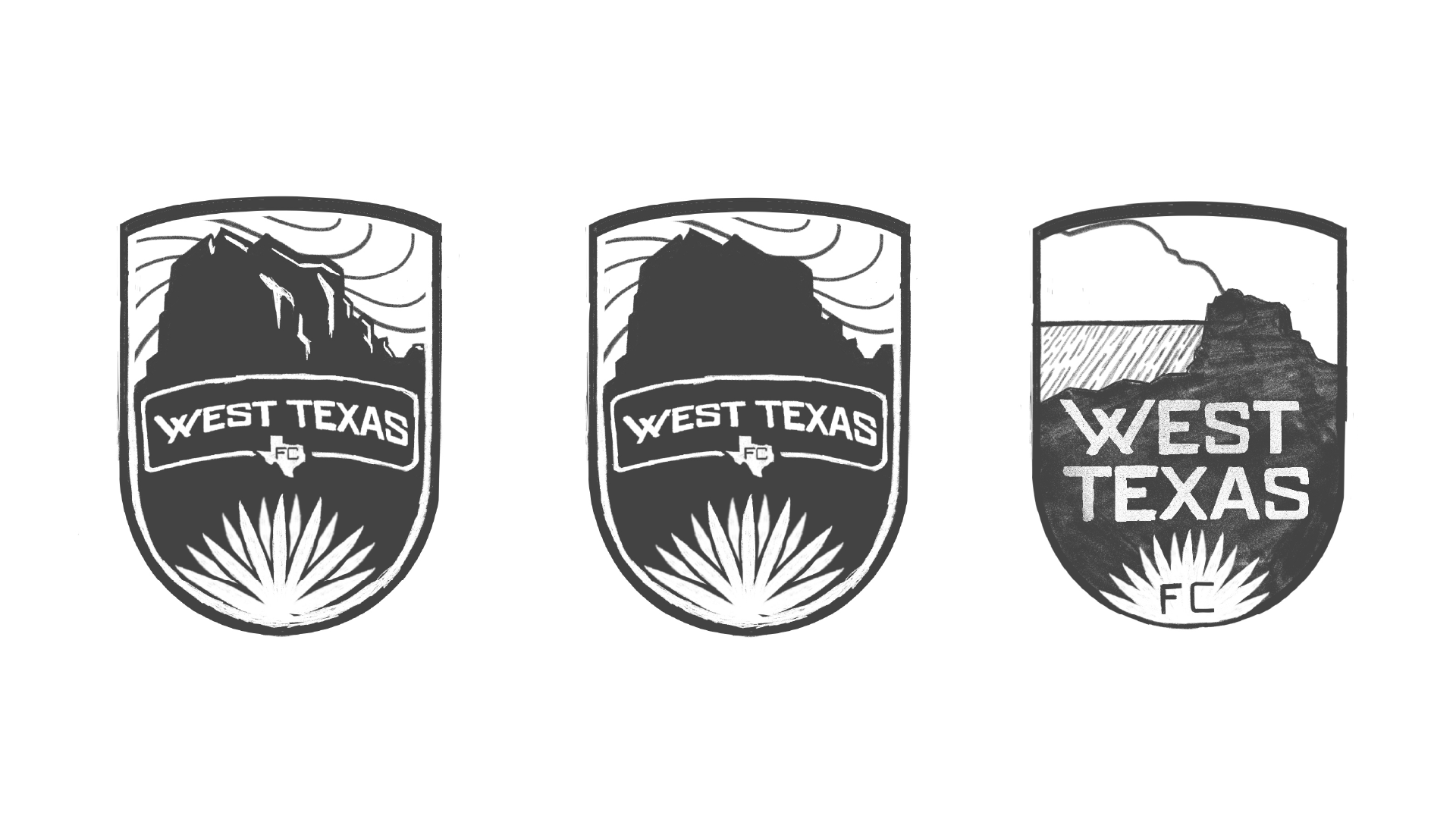
The client loved that direction, so we moved to digitization and experimentation. On weekly Zoom calls with the clients, we provided several variations of the primary, secondary and word mark logos until we got it just right. Below, you’ll see the process from digitization to 1-color approvals.
Primary Logo
We decided early on that we wanted to go in a landscape direction. There are so many teams out there with animal or character mascots, and we wanted West Texas to stand apart - not only from their competition, but also other sports franchises.
The client mentioned early on that they did not want their brand to be tied specifically to oil, which is one of the area’s main exports. Instead, we provided the client with a multitude of sketches concentrating on other references in the region. From landscapes to windmills, you can see some of those down in the Extras section.
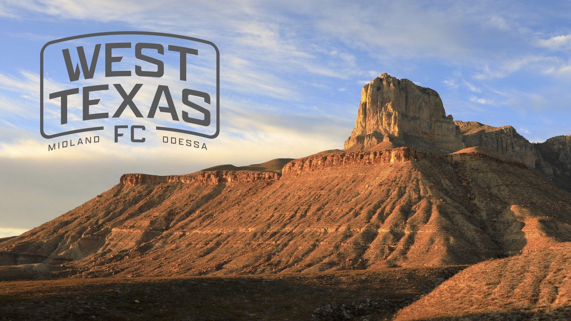
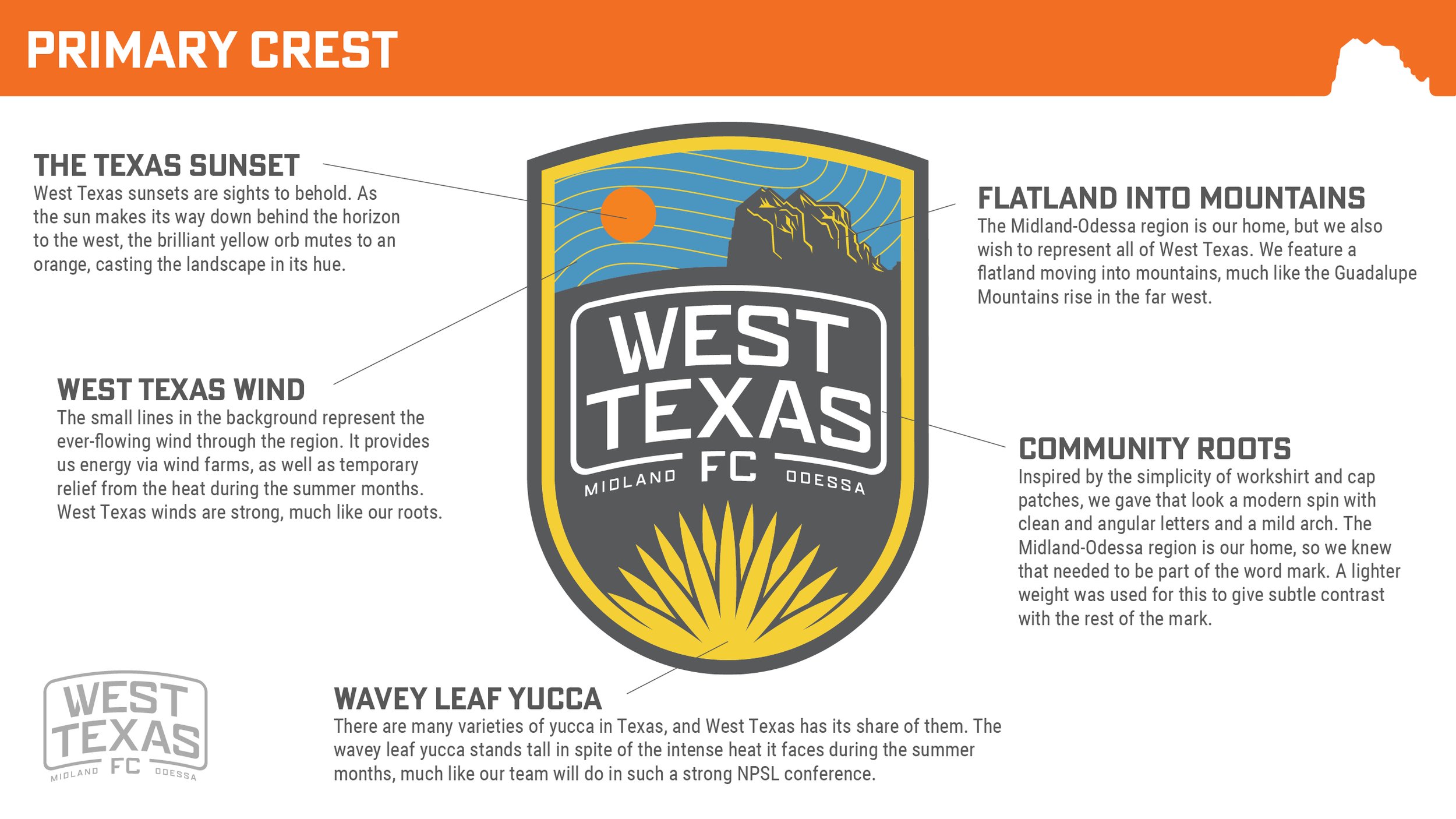
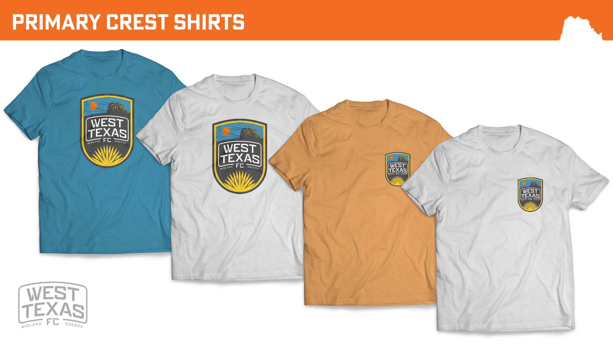
In the end, the client chose our sketches of a couple of West Texas’s most recognizable images: the mesas of Big Bend National Park, and the yucca plant.
It went through several tweaks after that, eventually ending with the final version above.
Secondary Logo
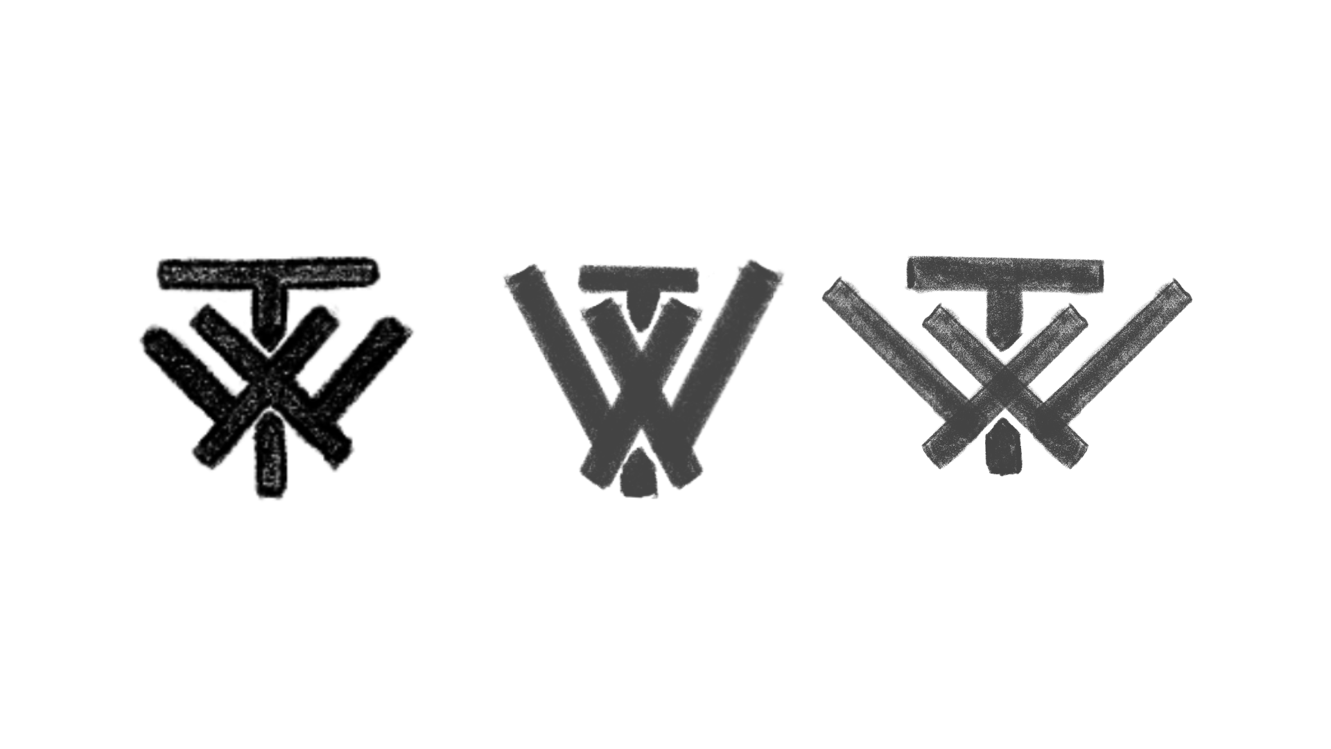
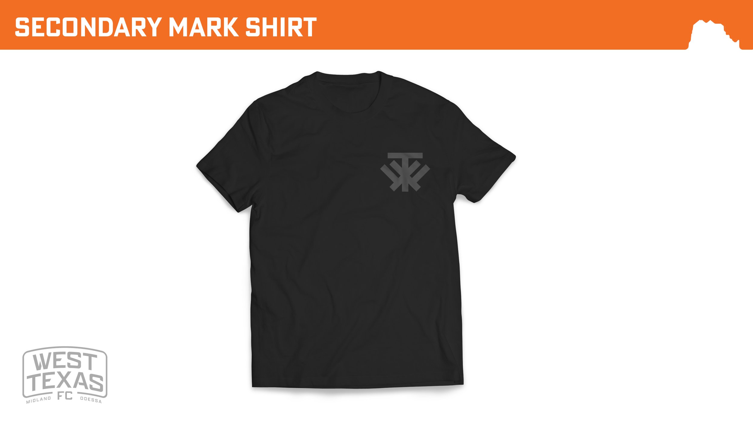
For the secondary logo, we wanted to create a strong instantly recognizable icon. We leaned on three main pillars when creating this:
We’re big fans of simplistic letter-based icons, found heavily amongst Major League Baseball teams (see: NY, San Francisco, San Diego, etc.).
West Texas is populated heavily with ranches, each having its own unique brand to signify animal ownership and identification. Each is comprised of a combination of letters or symbols in a compact shape.
Our creative director is an enrolled Choctaw tribal member, and is heavily influenced by the early iconography of various Native American tribes. This also played a major part in the overall look.
The secondary logo went through many experiments at varying weights, sizes and offsets, but it came down to the beautiful chunky logo you see above.
Word Mark
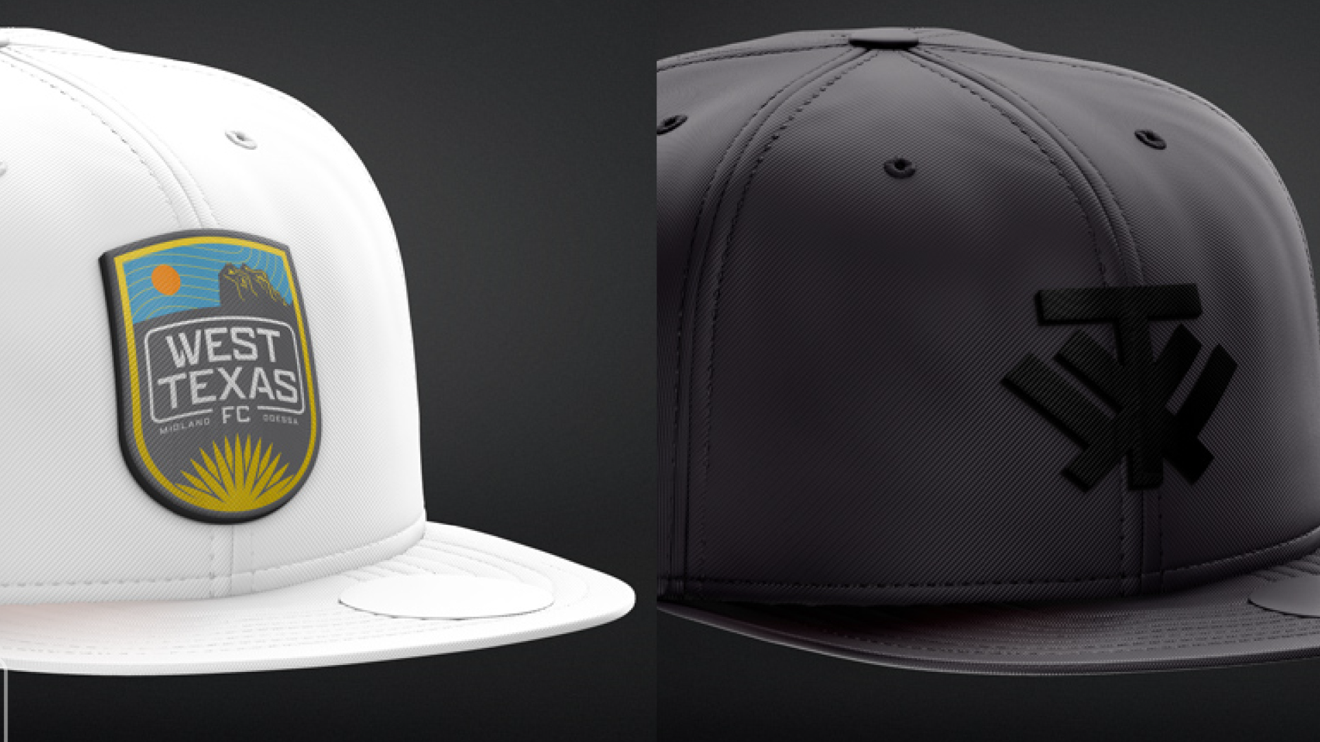
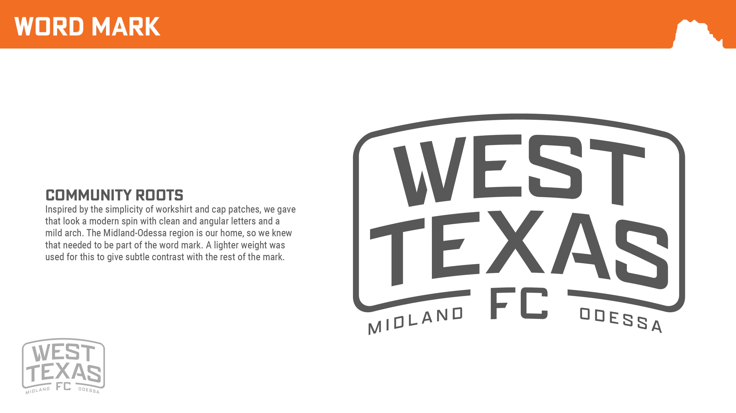
Inspired by the simplicity of workshirt and cap patches, we gave that look a modern spin with clean and angular letters and a mild arch. The text went through some experimentation before arriving at the final look.
To really make a word mark unique, it’s a good plan to customize the letters instead of using a plain font. We started with a base typeface: Apotek Extended, Designed by Dyana Weissman from Kerns & Cairns.
We initially tried the W from the secondary logo as the first letter in the word mark. As you’ll see above, that didn’t quite work out the way we were hoping. So, we pivoted and began customizing the W in different ways before we arrived at the final version.
We also tried it flat versus arched, and we ultimately landed on the movement of the arch. It gives a shaped cap bill feel and fits within the theme nicely.
Color Me Bad (meaning good)
Color is a funny thing in sports. It can become a major part of the team’s identity (see The Reds, a.k.a. Manchester United … or Liverpool, we guess), therefore trickling to the supporter. Some sports fans won’t even wear plain clothing that inadvertently coincides with a rival’s main color.
That said, we wanted to concentrate on non-conventional color schemes. This was an important piece of making this brand stand apart.
Color Palette 01
We called this the Sunset palette. West Texas is very famous for their breathtaking sunsets full of brilliant purples, oranges and yellows.
Color Palette 02
The closest we come to traditional sports colors, this is still a bit of a reference to the sunset. It’s also reminiscent of the Florida State colors, which is why it was ultimately not picked.
Color Palette 03
We call this palette the Riverbed palette, borrowing from the blues of the water, the white caps of rapids and green of riverbed flora.
Color Palette 04
We call this one the Storm Chaser palette. West Texas is famous (infamous?) for its intense storms, and therefore popular with storm chasers. We pulled the dark blue and grey from the incoming weather, the peach / tan from the earth, and white from lightning.
Color Palette 05
For the fifth color palette, we combined several of the ideals of other color palettes whilst giving them their own feel. More on that in a sec.
We Have a Winner, Folks
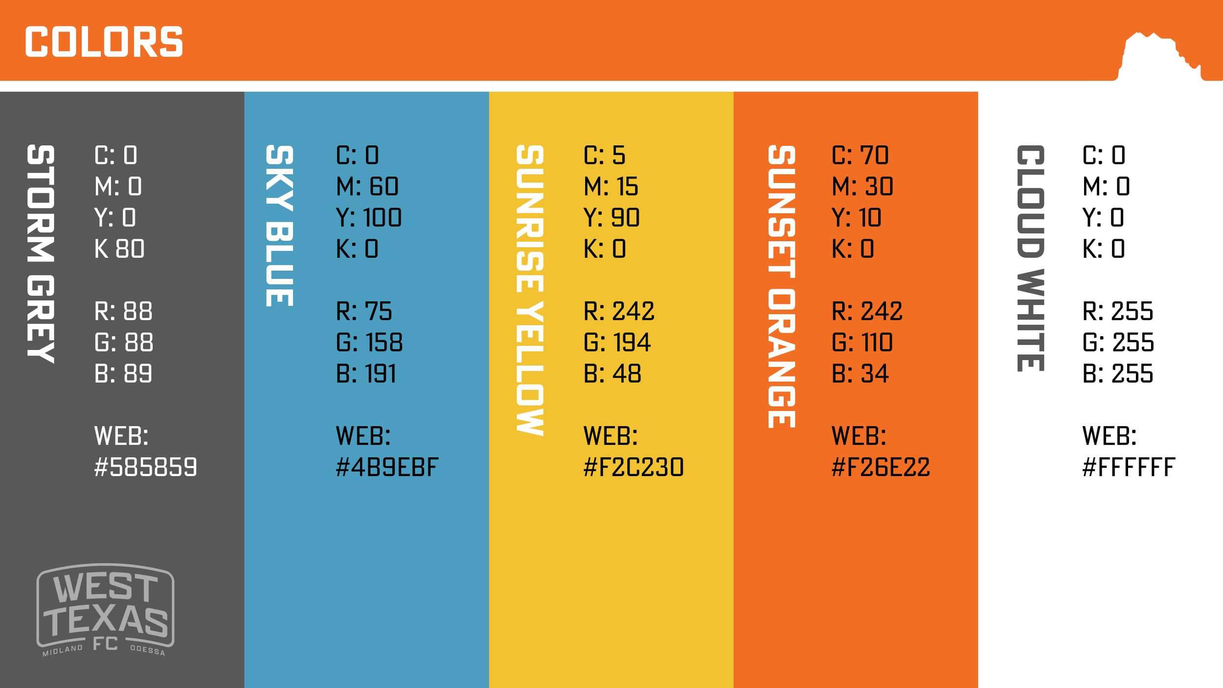
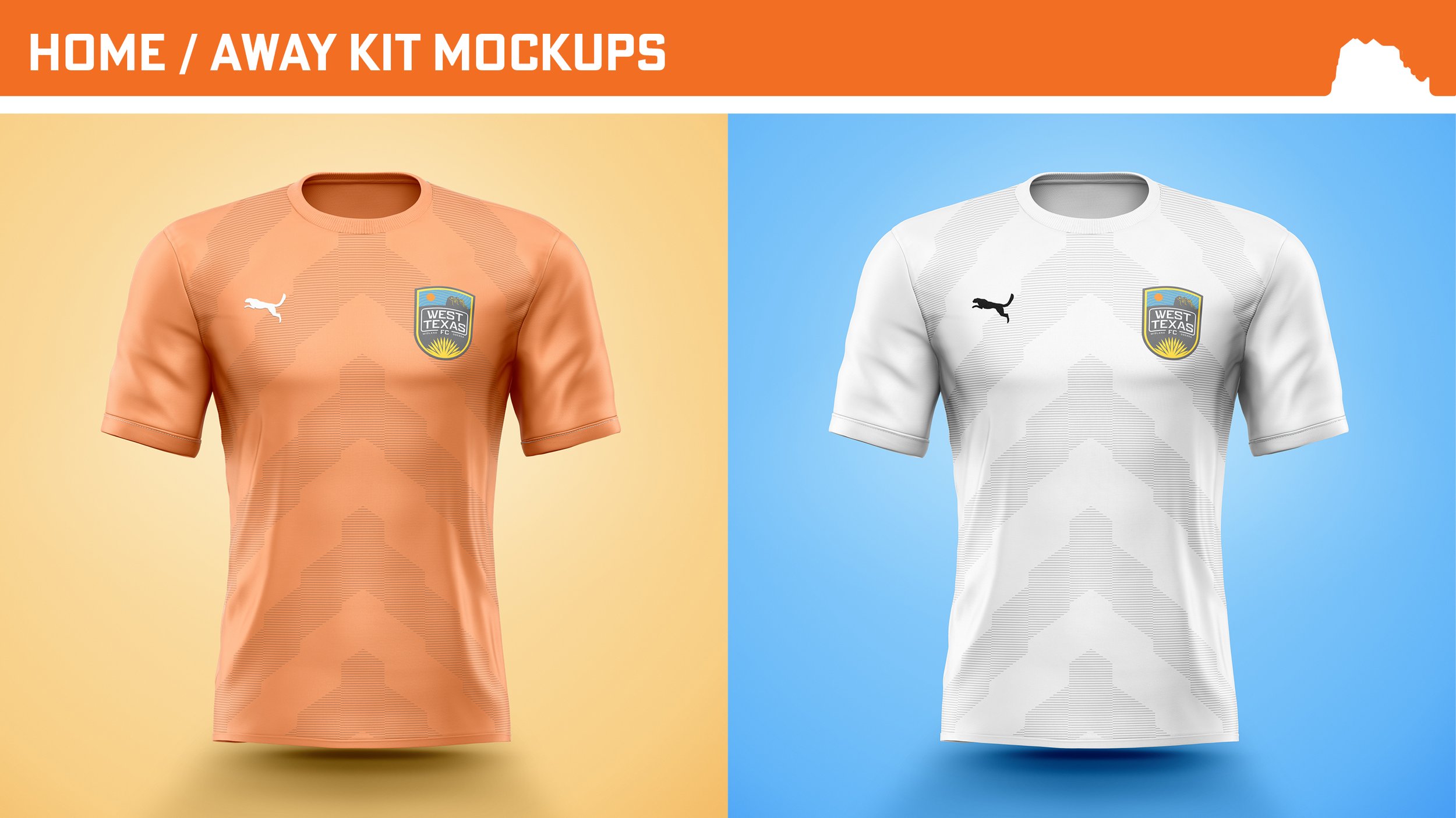
In our completely unbiased opinion (right), we feel the final palette is so strong. Each color perfectly represents an aspect of West Texas whilst complementing the other colors.
Relaunch Hype Video
Extras
Here are some extras from the creation process.


