Case Study TB05
Central Texas Coyotes FC
Location
Temple, TX
Year
2023
League
National Premier Soccer League (NPSL)
Service
Brand Refresh / Slight Rebrand
The Ask
Temple Coyotes FC was looking to give their brand a boost by altering their current location’s name from Temple to a more centralized area. Though they are proud to play in Temple, they were looking to cast a wider net. They engaged our services to accomplish this task.
A Look Back
The client wanted to keep the coyote theme. Other than that, we dove in to see what we wanted to work on.
The Overall Shape - We wanted to update the overall shape to be more dynamic.
The Coyote - We didn’t mind the simplistic coyote here, but we felt it could be gnarlier.
The Location Name - Their previous crest had MMXIX along the top, which is the year the club was founded in Temple. Though the client wanted to keep that on the crest somewhere, they were open to replacing that upper section.
The Colors - The client was happy overall with their current palette, but they were open to tweaks.
Making the Rounds
During the following weeks, we went through a few rounds of tooling and retooling.
Image 1
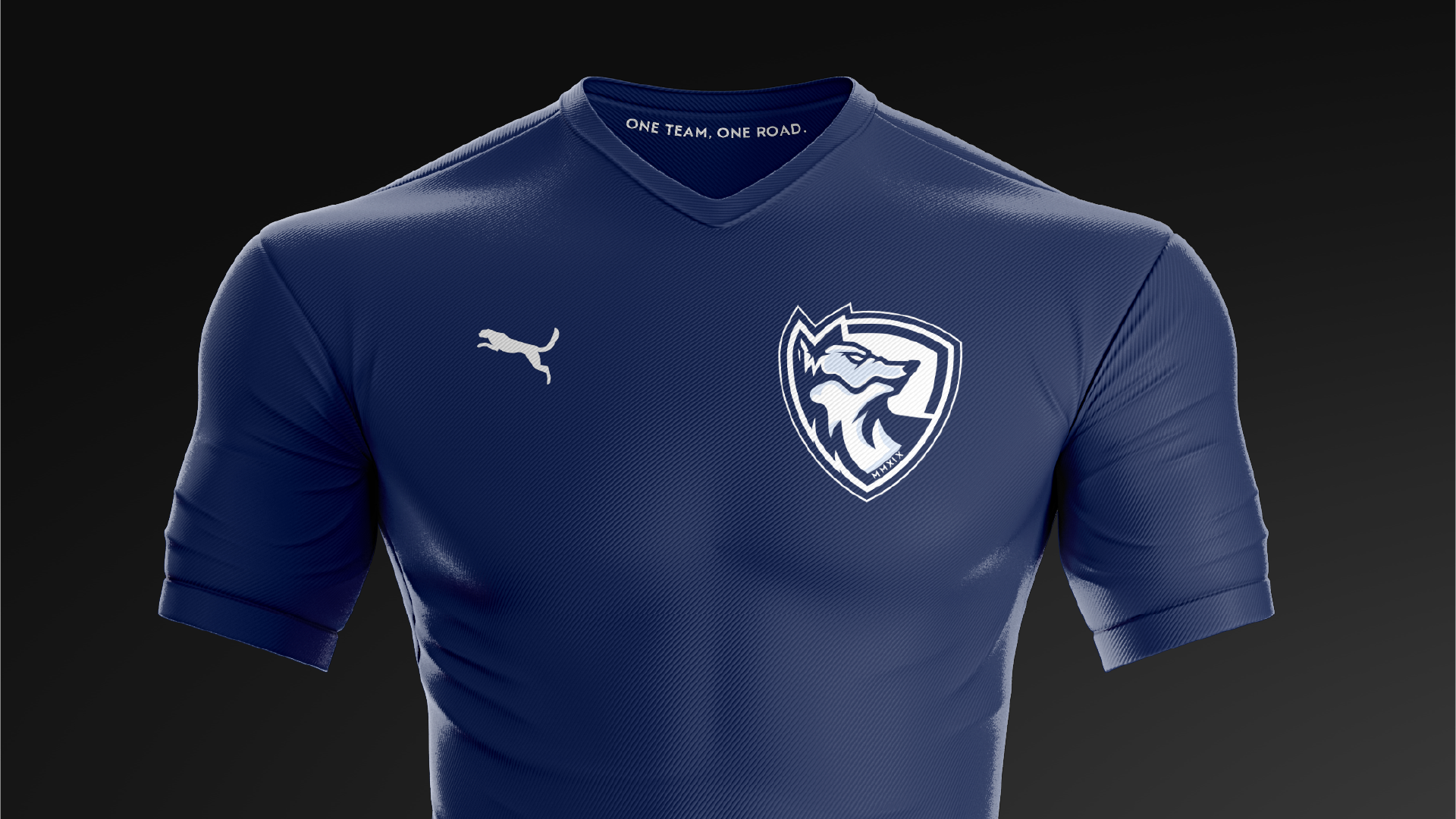
We like to push boundaries and experiment, and this is a good example. We wanted to create a crest that acts as its own icon, devoid of text (other than the year reference along the coyote’s collar). We loved how cool this coyote came out, as it has a good flow. We also introduced a darker, more navy blue, with a secondary baby blue and white.
Image 2
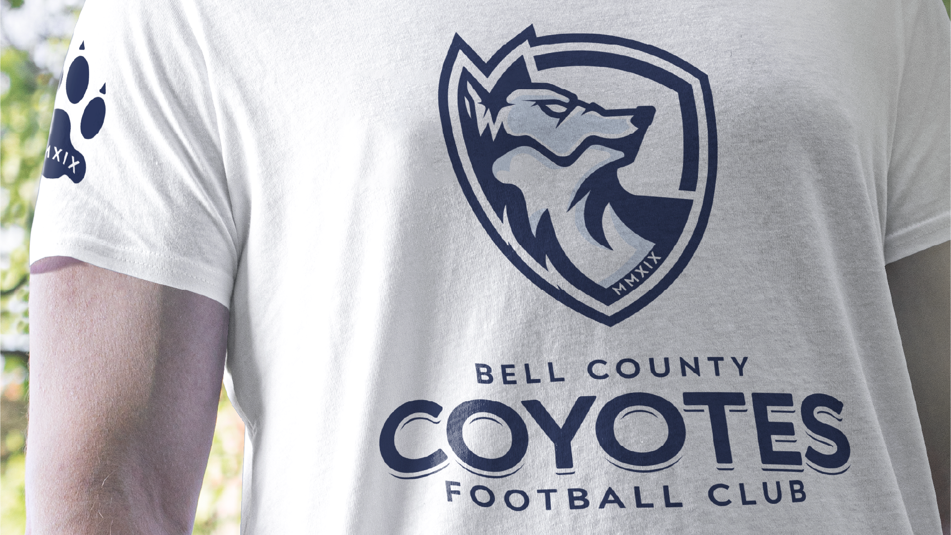
This is a secondary mark we made using a coyote’s paw print. We intended this to be used as an easter egg on merchandise, kits, etc. See the Extras section at the bottom for an example.
Image 3
Here, we created a simple word mark with a subtle detached block shadow. We provided two versions, as the client was still unsure which name they wanted to move forward with.
Image 4
The client loved the textless crest and wanted to move forward. However, we were informed by NPSL that a team’s crest was required to have the team name on it somewhere. So, we provided an alternative version that snuck the text in without disrupting overall.
Winner Winner Coyote Dinner
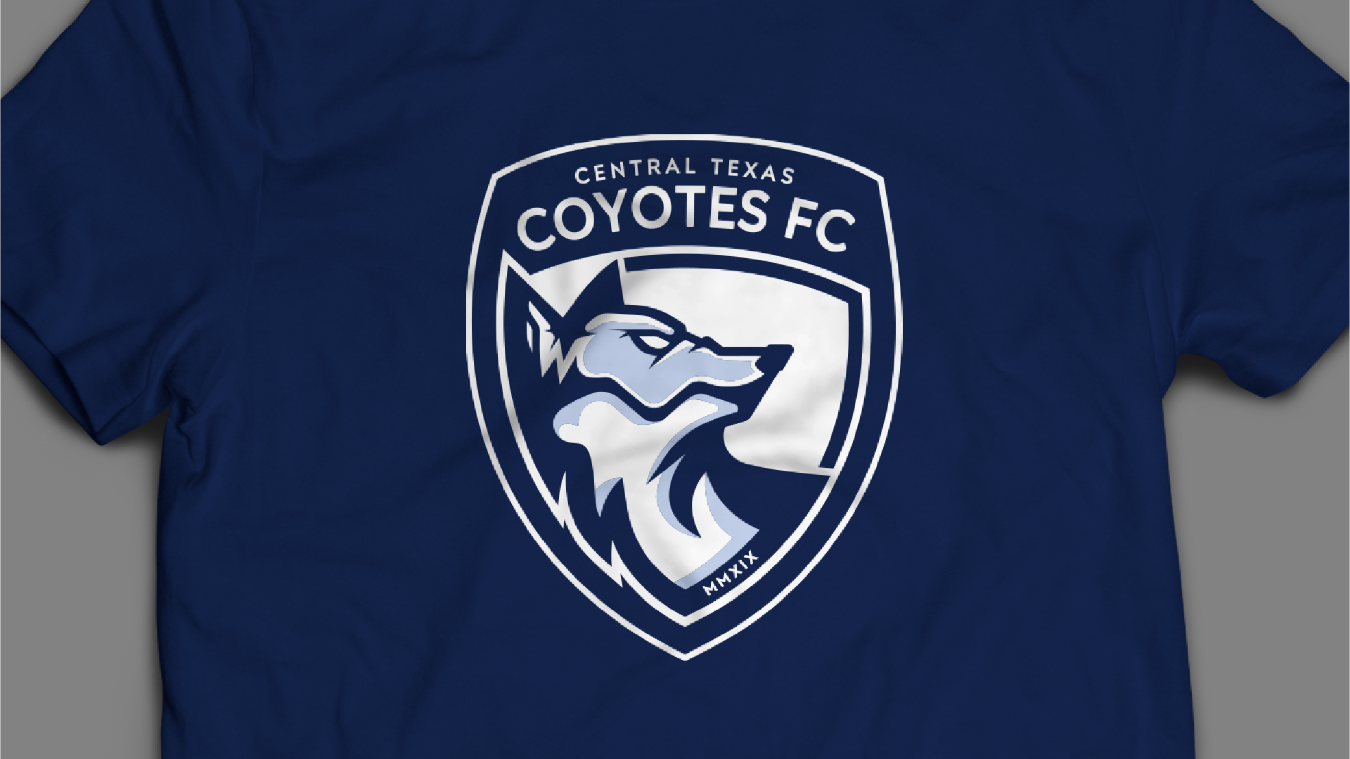
After a bit of back and forth, we finalized a different version that ended up being the final. We still kept the original as a whole, then encased it within a full shape. Rounding out the top is the team’s name. Since the client decided to move forward as Central Texas Coyotes FC, we provided the updated word mark as well.
Extras
With the client being an established club, we didn’t need to provide them with as much as we have with other clients. That said, we did do some mockups for them so they could see end-use examples.


