Case Study TB02
LUBBOCK MATADORS SC
League
National Premier Soccer League (NPSL)
Service
Full Branding
Location
Lubbock, TX
Year
2021-22
The Ask
The client was looking to build a soccer team in Lubbock, TX, an area yearning for semi-pro and pro sports. Lubbock is home to Texas Tech University, and much of the area heavily supports the school. That said, the client wanted a brand that reflected that. Texas Tech’s original football team was named The Matadors before becoming the Red Raiders, and that was a perfect fit for the client’s team’s brand.
The Colors
In a rare divergence from our process, the colors were decided early on. Lubbock is well known to be red and black, in accordance with Texas Tech. It was natural to lean into that. The three main colors are Toro Black, Matador Red, and Cotton. The lighter grey is Toro Black at 90%.
Round 1
For the first round, we gave three concepts: The Bull Horn, Modern Bull, and Stylized Bull.
Bull Horn (Concept 1)
For this concept, We concentrated on simple and abstract. We wanted something that referenced a matador or bull without coming right out and saying it. Our main thought was to make a badge that would be recognizable from distance.
Modern Bull (Concept 2)
This concept introduces a bull to the logo. Still simple, again focused on being readable from a distance. The soccer ball’s pattern is also a subtle cotton blossom, referencing the region’s major crop.
Stylized Bull (Concept 3)
This version introduced more detail into the bull, including a twist in its horns and bullring. We also added a matador’s red cape to directly reference its namesake.
Client Notes
Concept 1
The client thought the one horn concept would get lost on people.
They liked the idea of using the cotton shape as a tie-in.
They mentioned using the bull from Concept 3 for this style.
They asked if simple Bull head would be more memorable.
They liked the idea of using windmill imagery in place of the cotton elements from this version.
Concept 2
The client stated that Concept 2 was growing on them, but ultimately felt it was not as strong as concept 3. It was removed from contention.
Concept 3
The client stated that some feedback was received that the secondary logo looks like a bull’s rear end.
They suggested removing the Texas to simplify, and one partner recommended removing the soccer ball from the primary logo and word mark.
They also mentioned a simpler bull head design as they did for Concept 1.
Round 2
Taking the feedback given, we got to work on refining and creating where it was needed. We moved forward with two designs: a conventional shield shape, and an unconventional shape.
Concept 1
Primary
We took the stylized bull and placed it within a cotton blossom. Flanking each side and breaking up the words are classic windmills, which were staples on every farm. We included some alternative versions as well, including a version with modern wind turbines, the cotton blossom as the full shape, and the bull’s head as the lone icon within the center.
Secondary
We carried the secondary logo over, but made the M and horns more substantial. We also included alternative versions of it, including a cotton blossom, a West Texas sunrise, and a classic windmill.
Word Mark
For the word mark, we carried the previous version over. We thickened the text to make it beefier (no pun intended), and introduced an offset and block shadow.
Concept 2
Primary
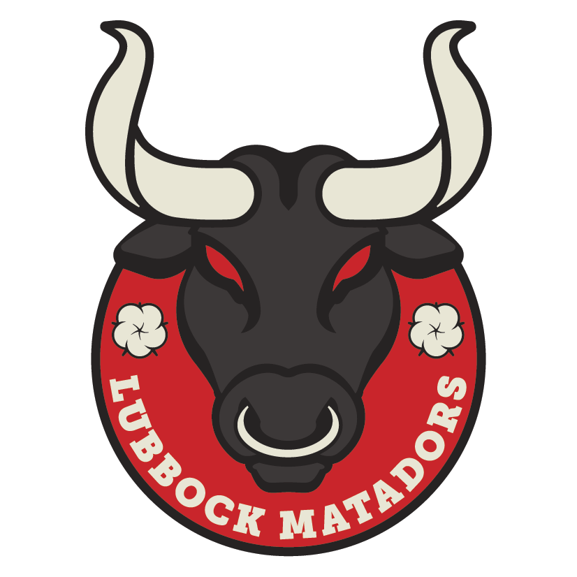
Going for a forward-facing bull, we gave him angry eyes, a gnarly bull ring and some cool twisted horns. We were hesitant to place the bull’s head in a traditional soccer crest shape. We felt the horns looked too sweet to encase them. So, we punched the top of the bull’s head out of a circle. We carried over the cotton blossoms (again, major agriculture area), and ran the text along the inside bottom of the circle.
Secondary
We kept the general idea of Concept 1’s secondary logo, but we carried over the text treatment of Concept 2’s M. We tied Concept 2’s primary horns over, feeling it struck more visually. We also made a flourish on the M in the shape of an L.
Word Mark
For this word mark, we started again with the base text treatment, then gave the bottom an inward curve. We also provided an alternative look with the bull’s head within the M.
The Finals
Ultimately, the client went with Round 2’s second concept. Each of the logos and word mark carry the same horns, making all three a cohesive unit, though strong on their own.
The client loved the fierce look of the bull in the primary logo, as well as the unconventional final shape. They felt the cotton was a perfect addition as well. For the secondary logo and word mark, they loved the horns carrying over from the primary logo.
Here’s a hype video we created for the launch.
By the Numbers
Numbers provided by the club in Aug 2023.
4,800
Average Fans per Game in 2023
5,842
Record Number of Fans for Home Playoff Game
$550K
in Sponsorships in 2023
Extras
Here are a few other cool things we’ve done for Lubbock.
Notorious the Bull
At the NPSL level, you don’t normally see official mascots. But that’s just what Lubbock has, and his name is Notorious.
‘Notorious the Bull was named by a fan vote, and is designed from the primary logo. He makes appearances around Lubbock, has his own social media accounts, and even has his own jersey sponsors (cheers to more revenue!).
Real World Applications
Merchandise Designs and Mockups
2023 Kit Sponsors Video


