Case Study TB06
865 Alliance
Location
Knoxville, TN
Year
2023
League
National Premier Soccer League (NPSL)
Service
Brand Refresh
The Ask
FC Alliance Soccer Club (a 501C3 non-profit organization) has been developing top youth talent in the Knoxville area since 2008. They felt it was time to create a NPSL mens team, as well as a womens side to compete in WPSL. They approached us to refresh and build the brand with a crisp professional look.
A Look Back
The client was open to any ideas, but we asked them what they did like about their previous branding. They weren’t necessarily married to any of the elements, so we reviewed and broke down aspects we would want to address:
The Overall Shape - It felt too “Interstate highway sign” to us.
Typeface - As futuristic as their typeface may have looked at the time, we felt it looked outdated. Weird how that works. We were later told by the client that this was a font used by Puma at the time of the logo’s creation.
The Ball - Though we understand the inclination to get a soccer ball into a club crest, we felt it looked a bit out of place here.
The Stripes - We didn’t mind the stripes, but we weren’t feeling the slant, nor the amount used.
The Colors - The client was open to an update to the overall brand palette.
Making the Rounds
During the following weeks, we went through a few rounds of tooling and retooling.
Image 1
We experimented with the overall shape, originally giving the client a couple of options. We also started with the original brand colors, but we quickly felt it needed something more. They liked the overall look, but felt the pentagonal shape felt too much like a baseball home plate.
Image 2
For the next round, we introduced a combinations of blues and whites. We felt that palette lent itself well to the overall brand. We also created some secondary logo options, focusing more on a circular shape or no bounding shape.
Images 3-4
Overall, the client was excited about the direction. The only concern they brought up was having the 865 below Alliance, thinking people may confuse the name’s order. So, we gave options with that switched as well.
Folks, We Have a Winner
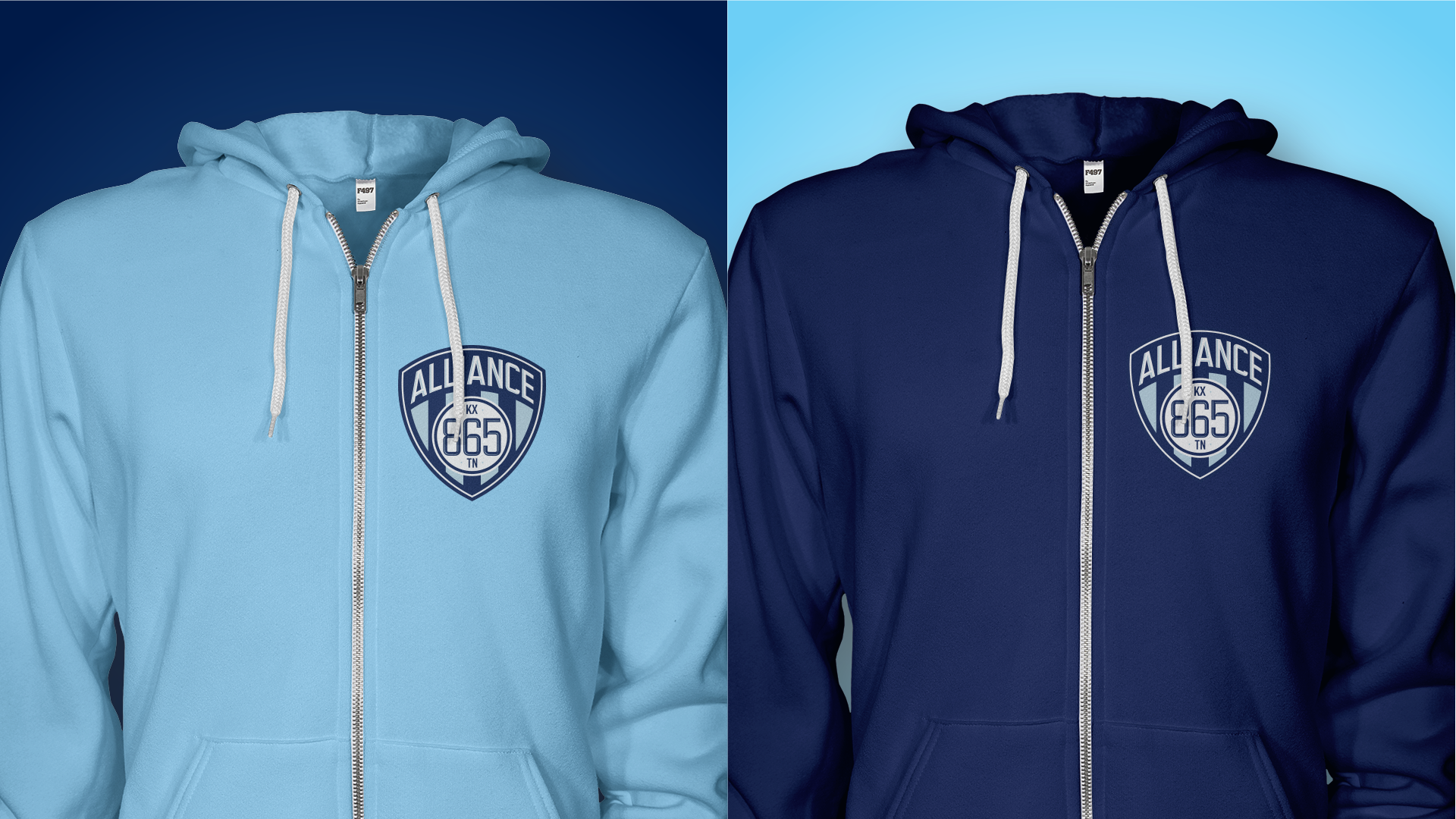
In our opinion, the 865 being in the lower half of the crest worked best. After sitting on it for a few, the client agreed and we moved forward. We gave them two versions: One that’s light on dark, and one that’s dark on light. This was done to give them more flexibility with kits and merchandise.
We also finalized the secondary logo, which is essentially the 865 circle from the crest as a standalone. The client also asked for an earlier concept we had provided that stacked the text. They used this for some merchandise and other things.
Extras
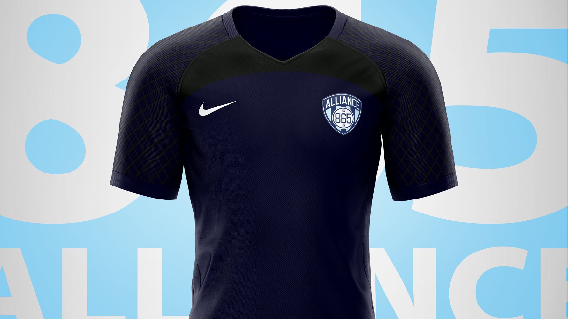
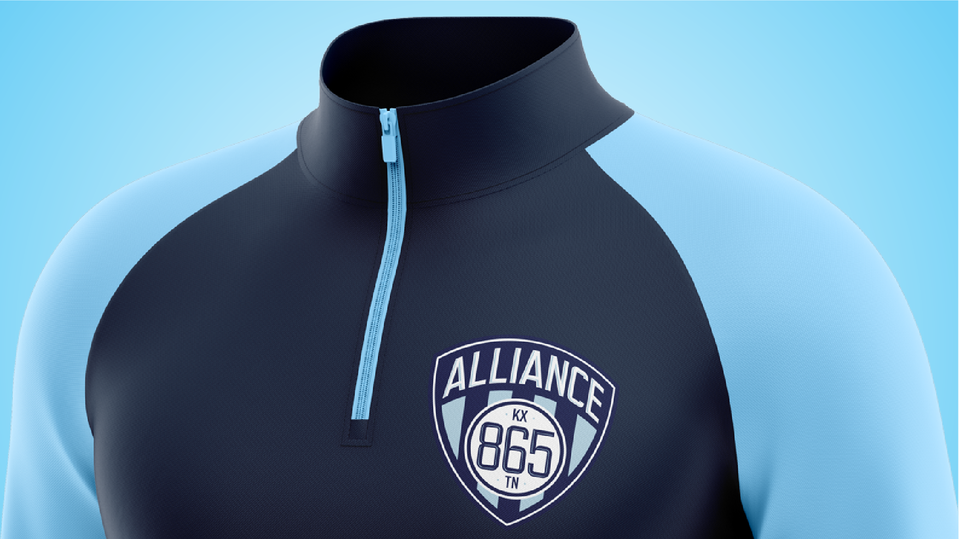
With the client being an established club, we didn’t need to provide them with as much as we have with other clients. That said, we did do some mockups for them so they could see end-use examples.


