Case Study TB03
CHARLOTTETOWNE HOPS FC
League
National Premier Soccer League (NPSL)
Service
Full Branding
Location
Charlotte, NC
Year
2022
The Ask
Beer and soccer: one of our favorite combos.
The client was looking to create a NPSL team in Charlotte, NC, with a brand focused on the thriving beer scene. They engaged us to realize their vision. The name of the club, Charlottetowne, is a reference to a purported early nickname for the area.
In the Beginning
For the first round, we like to start simple. We can always go more detailed later on, but it helps us to start with the most simple shapes and ideas first. They may not work out, but we like to exhaust our options to get where we’re looking to go.
Initial Concept
Charlotte, NC, is known as The Queen City after its namesake, Queen Sophia Charlotte of Mecklenburg-Strelitz. Imagery you’ll often see around the city revolves around a crown or royalty. For our first round, we concentrated on a couple of elements: a crown, and a combination of the C and H as a standalone icon.
Ultimately, the client wanted to veer away from the Queen City reference. They felt it was a little overplayed in the area, so we pivoted for the next round.
Also, we knew we wanted a word mark or secondary logo that abbreviated “Charlottetowne.” Pretty early on, we came up with the “Ye Olde C-Towne” moniker, and it stuck.
Ding Ding! Round Two
Some of the client feedback we received after Round 1 was that they wanted a more straight-forward beer reference. This was our concentration for Round 2.
Round 2 Concepts
There was some discussion around which shape the badge should be. During this stage, we thought it would be fun and unique to make the badge in the shape of a beer bottle cap. We had some fun with the iconography, trying an overflowing pint in one and a hop flower in another. For the third, we included the original CH with a crown. We knew the client wanted to lean away from that imagery, but we liked it so much that we threw it in anyway. The most the client can say is no, but sometimes it takes them seeing it created to sway them.
One other main influence for this direction was brewery tin tackers. For the uninitiated, tin tackers are the brewery or beer logos you see on the wall at bars. In the olden days, they were made of metal (usually tin). They sometimes still are. The bottom area of the concept that houses “FC” has two circles. Those reference the brads or nail heads used to mount tin tackers to the wall.
Three (It’s a Magic Number)
The bottle cap concept was a big hit, so we moved forward with it.
Round 3 Concepts
By this point, we had narrowed it down to two options: the CH with small crown and the hop flower. On both, we rounded the inside of the shape with Charlottetowne, and we put Hops in the tin tacker reference area. We also included a word mark version that included the “C-Towne” abbreviation.
Barkeep, Another!
The client loved the hop flower. They felt it was the perfect beer reference for their brand. They did feel people may confuse them with a brewery, since there was no soccer reference in the logo. To address that, we added FC to the bottom area. This eased their apprehension, and the one-color version was approved. Time for color!
Coloring Within the Lines
For these brand colors, we tried a couple of green options, as well as what we like to call “The Wild Card.” Every now and again, we throw stuff against the wall to see what sticks, hence the orange and grey.
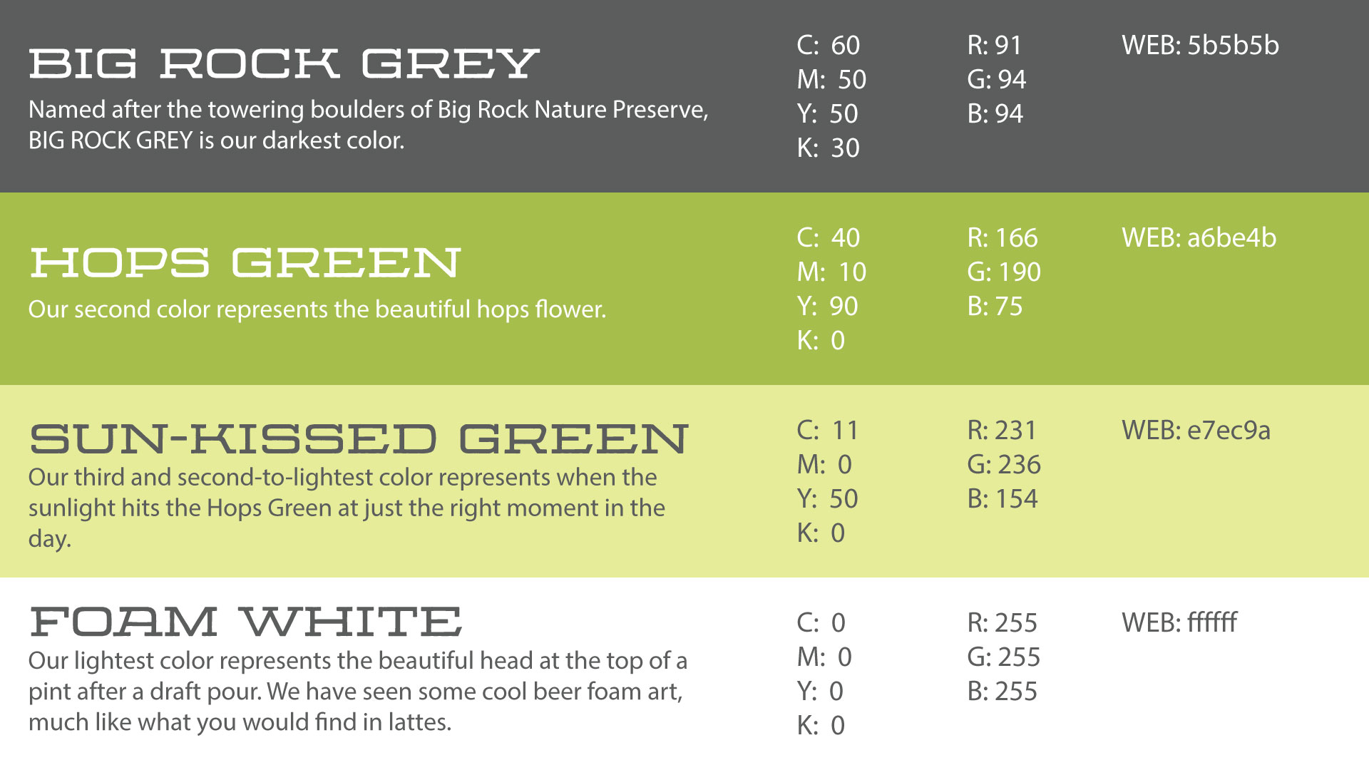
For one green color scheme, we pulled colors directly from the hop flower: a bit of soft yellow mixed in with green, plus a nice grey, to form an organic palette that feels vintage to us. For the other, we went with more bold greens and yellow.
We’re There!
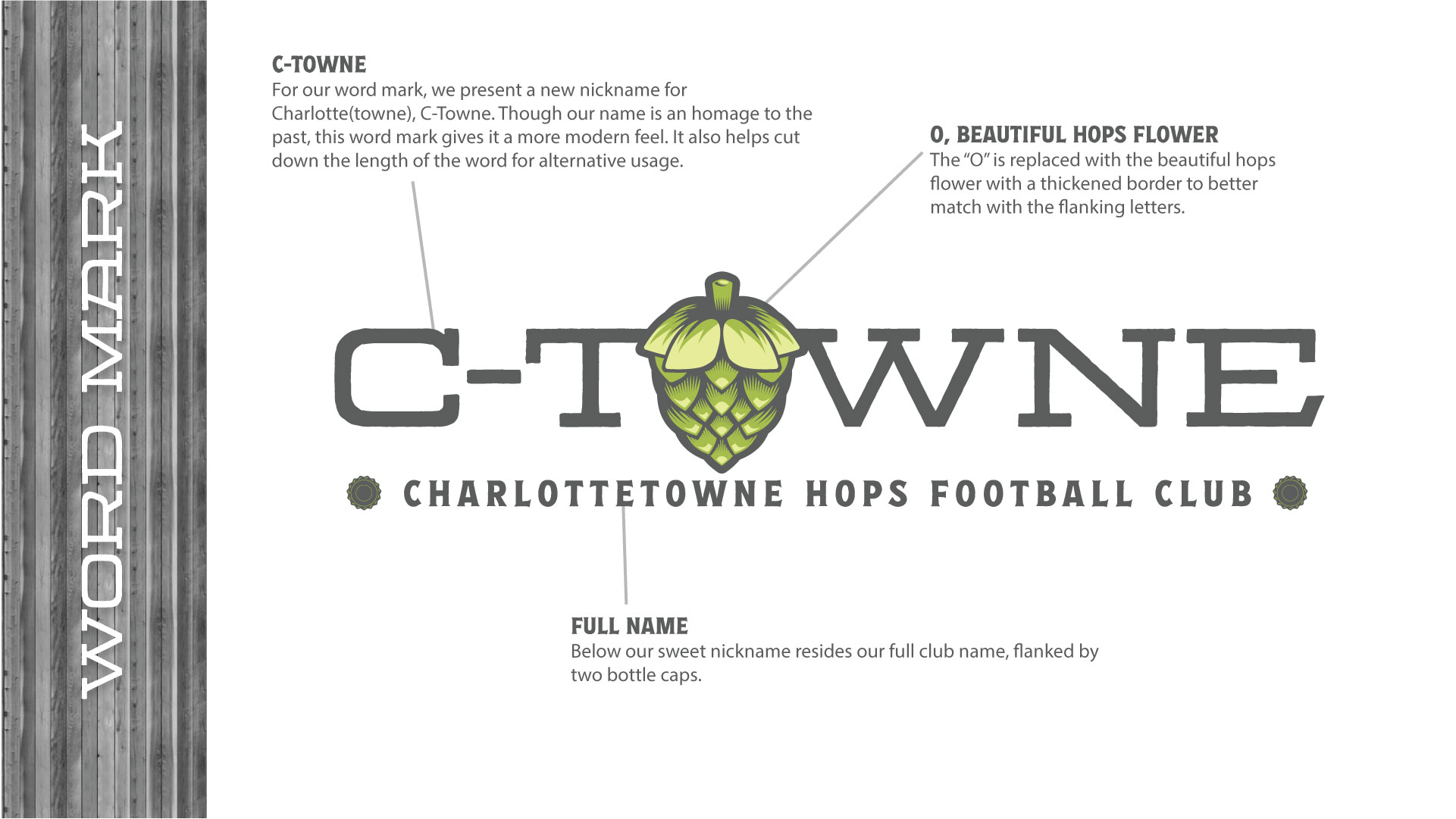
The vintage hop flower palette was a big hit. We moved forward with it, as well as a new word mark version that implemented the hop flower within the nickname. The full name can be found below, flanked by two bottle caps.
Here’s a hype video we created for the launch.
Extras
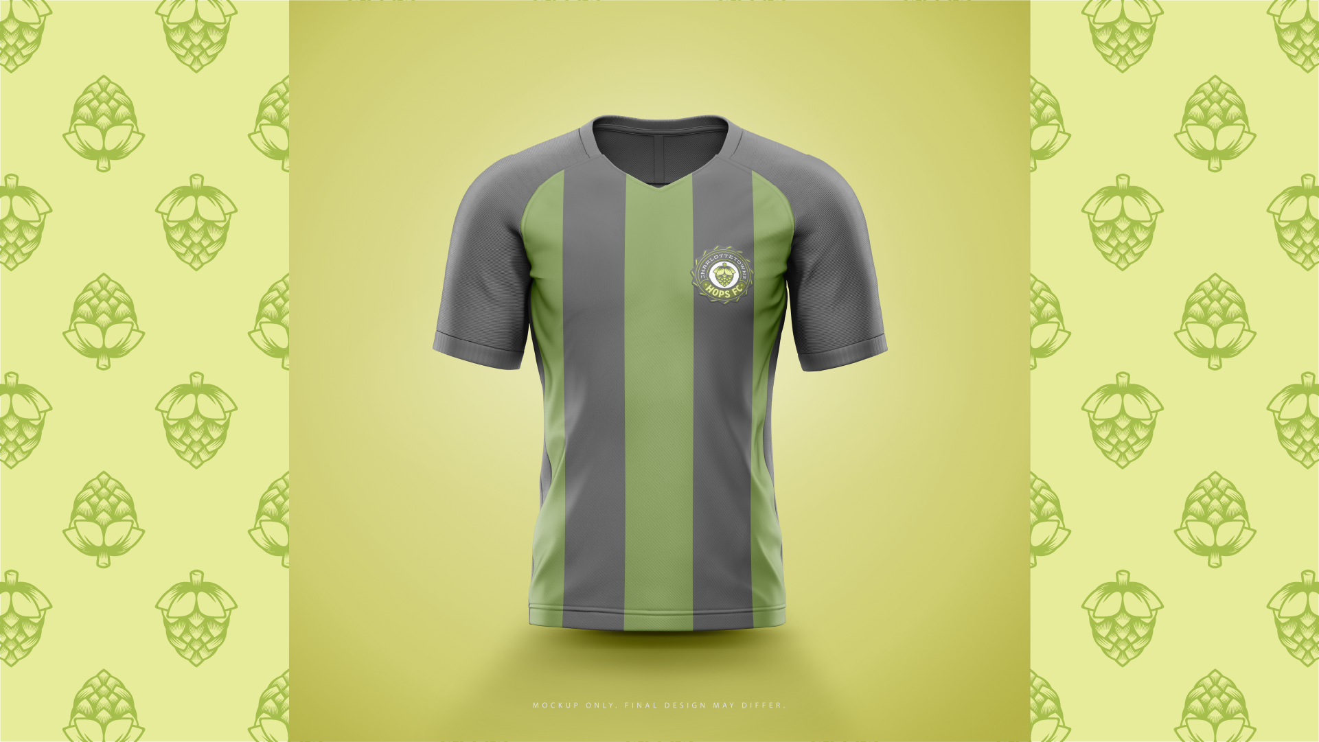
Here are a few extras from this project.


